Case study · UI Design
Bluegevity
Bringing clarity to a premium longevity subscription.
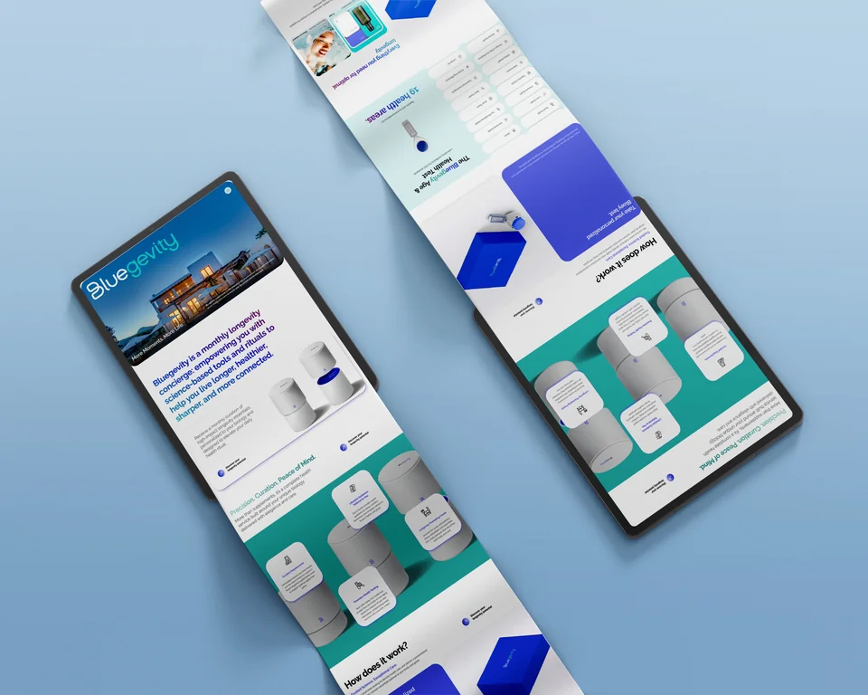
A website redesign connecting biomarker testing, personalised supplements and wellness retreats through a clearer structure and a refined visual direction.
The focus
Make a complex subscription offering easier to understand while expressing the brand’s premium positioning.
My role
Visual hierarchy, content structure, UI components and a consistent design system.
Design outcome
A redesigned website direction with dedicated sections for each service and a foundation for consistent future pages.
From problem to design
A clearer way to explore the offering
Before · The problem
Repetitive content and mixed service descriptions made it difficult to understand the subscription.
After · The design
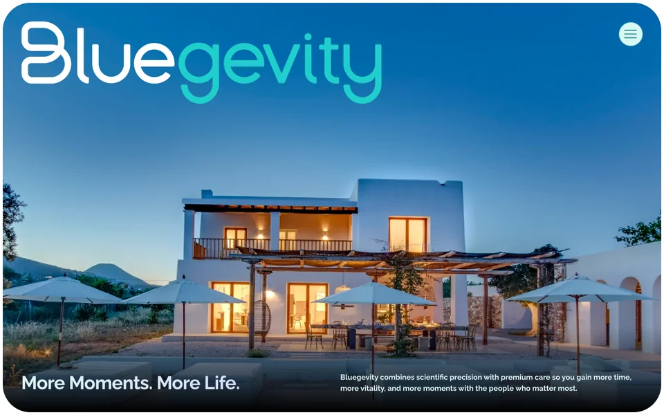
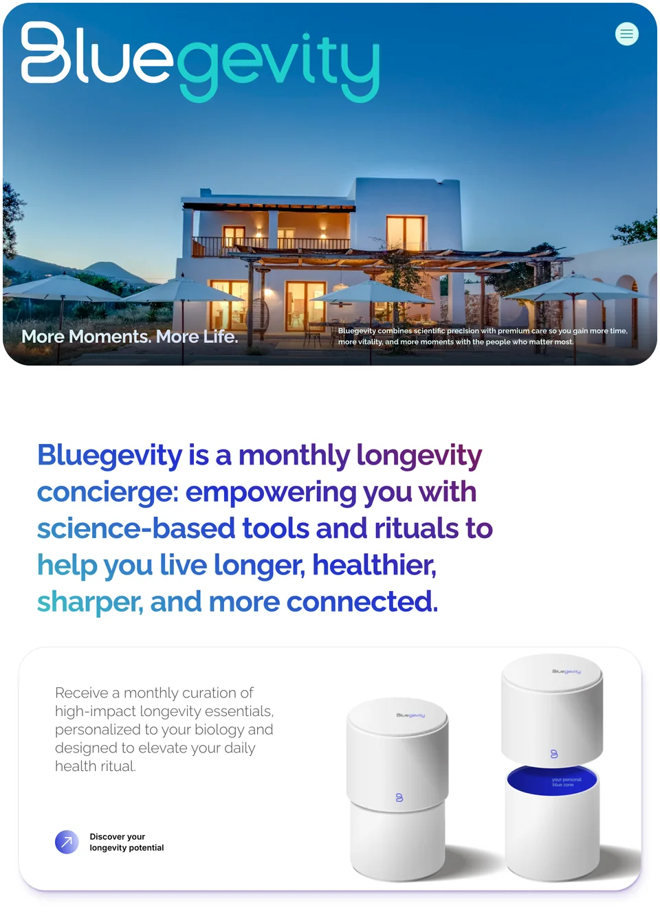
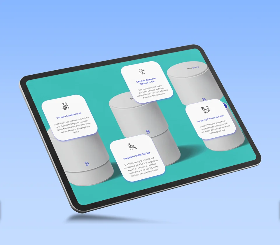
Dedicated sections for testing, supplements and retreats, supported by a clearer hierarchy and consistent interface components.
Have a similar challenge in mind?
Let’s talk