← Projects
UX & UI Design
Hotel Booking
The Problem
Leisure travelers are losing confidence mid-booking and walking away.
Hotel booking platforms are built to help people find a place to stay. Instead, they consistently erode trust at every step. Research for this project — including a survey, benchmarking of direct hotel websites, and usability observation — revealed a pattern that held across every participant: users weren't leaving because they couldn't find a hotel. They were leaving because the experience made them feel uncertain.
6 out of 10 survey participants had abandoned a hotel booking mid-process, all citing the same reasons: unexpected costs appearing late in the flow, too many steps creating decision fatigue, and star ratings that didn't feel trustworthy.
Key Decisions
Six design decisions, each rooted in what the research revealed.
-
01
Clarity & Visual Support
Users struggled to compare room options due to vague descriptions and lack of imagery. High-quality visuals and well-structured content were made essential at every step to support confident decision-making.
-
02
Navigation & Search Usability
Platforms felt overwhelming and disorganised. The redesign introduced clear paths, simpler layouts, and intuitive filtering — especially by price — so users could find relevant options quickly without losing their way.
-
03
Date Selection Flow
Inconsistent date pickers caused frustration and booking errors. The solution introduced a dual-month calendar with colour-coded price indicators, a stay length counter, and a clear confirm action — replacing ambiguity with control.
-
04
Pricing Transparency
Unexpected fees were the single biggest trigger for abandonment. Pricing was surfaced early and honestly, with taxes and fees clearly included on every room card so users never encountered a surprise at checkout.
-
05
Trust Signals
Reviews and ratings strongly influenced decisions but were often hard to find or trust. The redesign made social proof easy to access and prominently placed throughout the flow, helping users feel confident in their choices.
-
06
Mobile Responsiveness
While websites were the preferred booking method, users expected a seamless mobile experience. The prototype was designed responsively across desktop and mobile to ensure smooth interaction on any device.
The Solution
A hotel booking experience that earns confidence at every step.
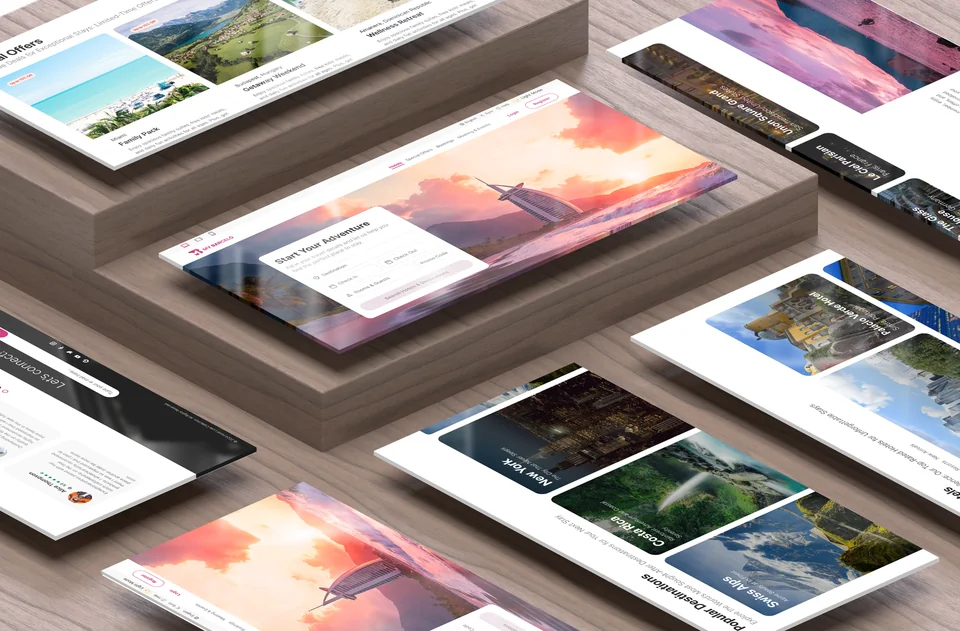
The redesign addressed the full booking flow from homepage to payment, built as an interactive hi-fi prototype in Figma under the fictional brand My Barceló. Every screen was designed to remove friction and introduce clarity where the existing experience had created doubt.
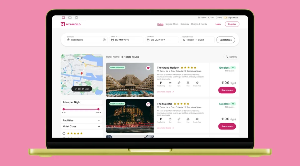
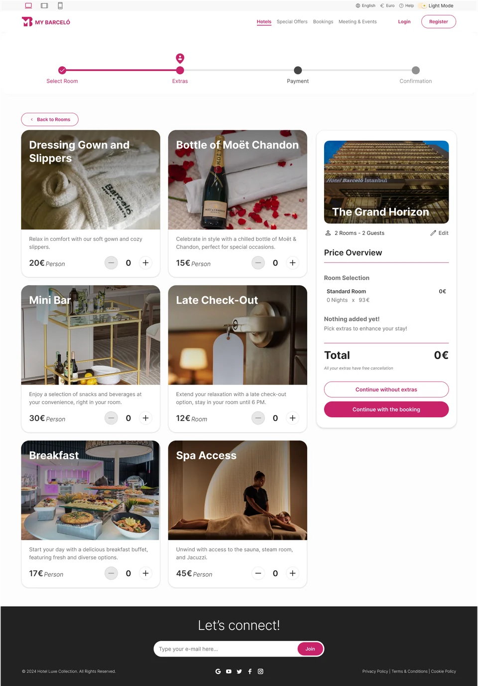
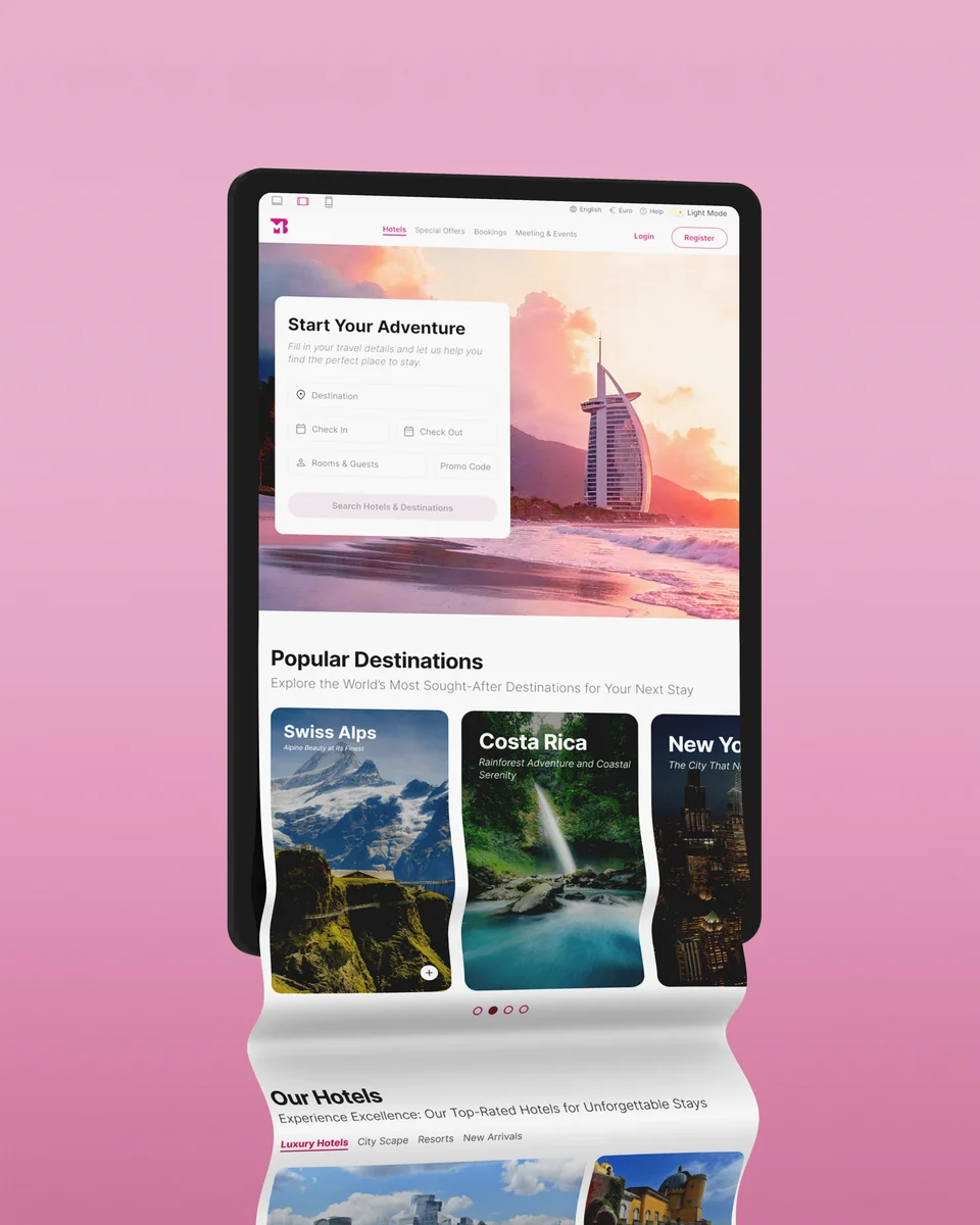
The homepage focuses on what matters: destination, dates, rooms, and guests. The date picker shows price levels per day. Search results lead with high-quality imagery, visible pricing, facilities, and review scores. The rooms page surfaces real user reviews and labels every option with taxes and fees already included. Extras are genuinely optional with transparent per-person pricing. The payment screen closes the journey with a full, itemised summary — no surprises, no hidden information.
What Happened
A diploma project — with real lessons.
This was a case study built for a Master's diploma, which meant no live users and no post-launch metrics. But the process was real, and so were the insights.
The research consistently pointed to the same truth: users don't abandon hotel bookings because they can't find a hotel — they abandon because the experience stops feeling trustworthy. Every design decision in this project was a direct response to that, and it shaped how I think about designing for trust in high-stakes digital experiences.